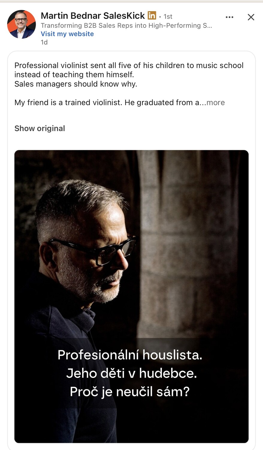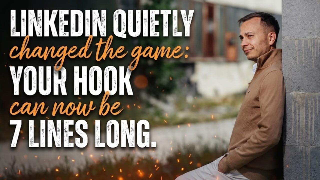
TL;DR / At a glance
- LinkedIn used to show one, two, three, in extreme cases four lines before the see 'more' button. It is now testing a range from one to seven lines.
- The visible text decides whether people click and read the rest of your post, so this matters.
- No clear correlation with a premium badge or a horizontal video. Leaving two blank lines doesn't force the button where you want it either, and three visible lines are not guaranteed.
- For now, expect anywhere from one to seven visible lines, both on desktop and mobile.
- One way to handle it: put the main hook into the picture.
Article
One line. Two lines. Three lines. In extreme cases, four lines. Until now. They are currently testing a much wider range: from one to seven lines. That is crucial information, because the text people see before the see 'more' button is what makes them decide whether to click and read the rest of your post.
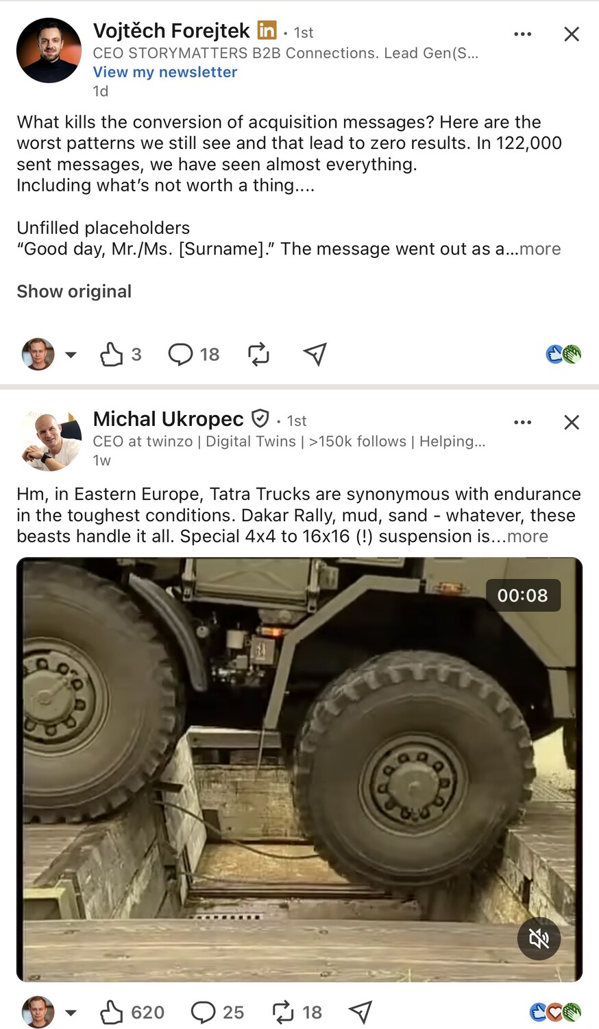
Vojtěch Forejtek's post got seven lines while Michal Ukropec's post only three lines.
Interesting, right? One of them has the premium badge; the other one does not. One of them used a horizontal video; the other one did not. The signals are clear: it must be...
Don't get ahead of yourselves, please:
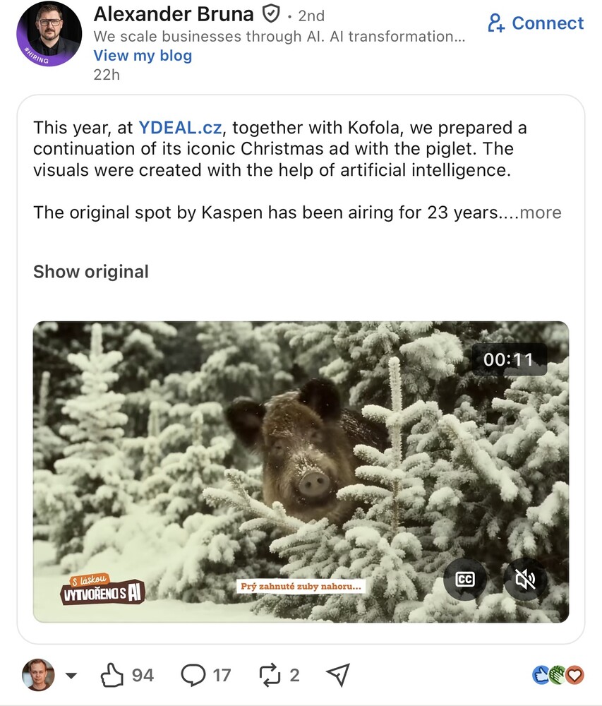
Oh no, Alexander Bruna, your post just proved there's no clear correlation between using a horizontal video, having a premium badge, and the number of lines shown before the see 'more' button.
Maybe we should just leave two blank lines to force the algorithm to place the button exactly where we want it?
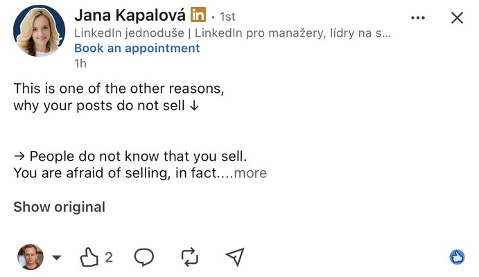
No, Jana Kapalová just proved that this won't work either.
So we shall expect that from now on there will be always at least three lines visible?
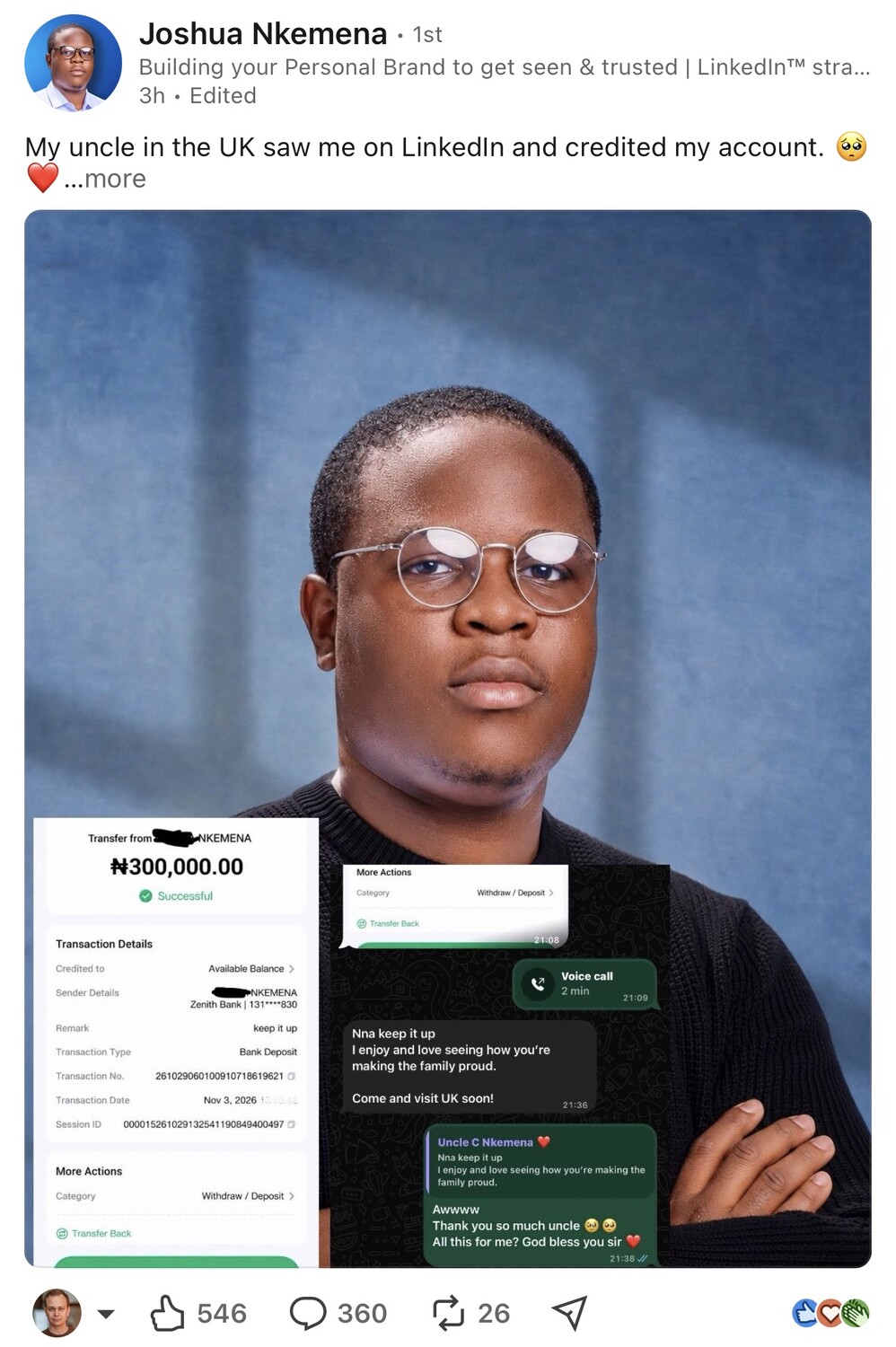
As Joshua Nkemena proves that no.
So what are the new rules? What should we expect? What should we do? For now, we just have to accept that anywhere from one to seven lines might be visible: both on desktop and mobile.
One possible way to handle this is shown by Martin Bednar SalesKick: just put the main hook into the picture.